ESSNTLS Lab: Branding/Packaging
Our goal is to support clear skin in the most natural way without clogging pours and for the most sensitive of skin types
Tasks
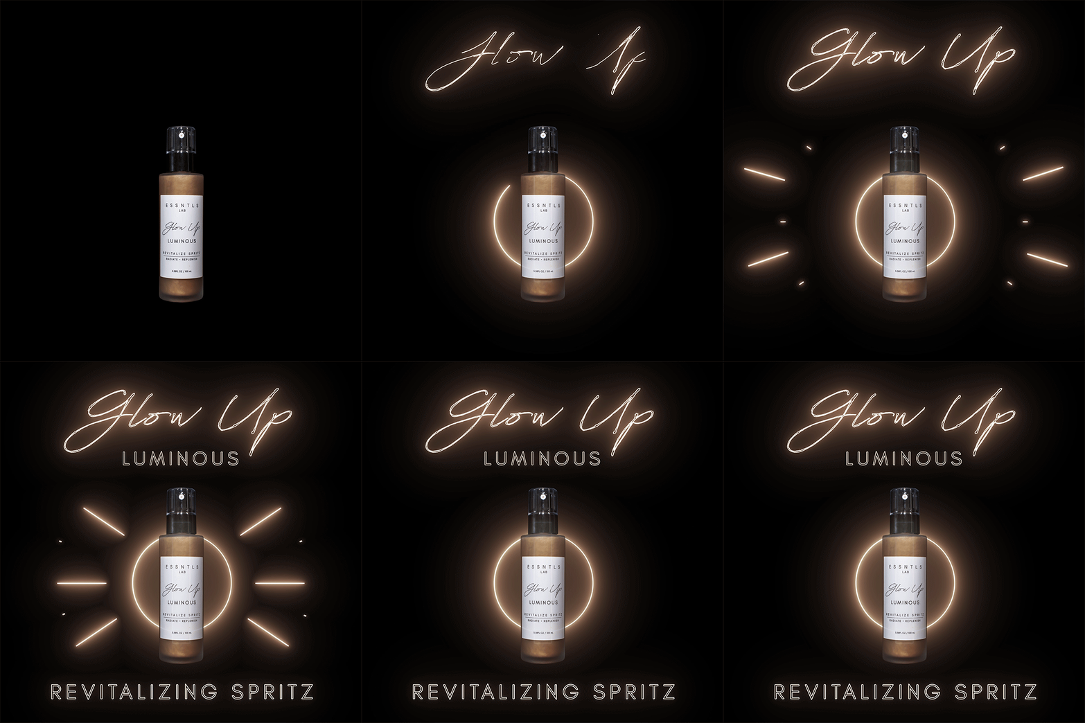
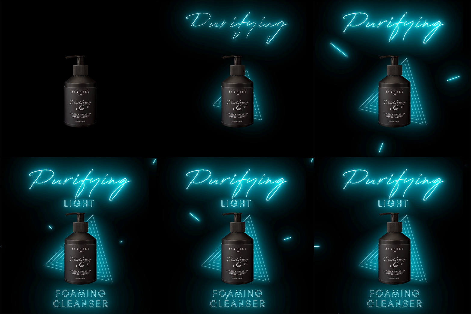
As a designer working on the ESSNTLS Lab, my task was to develop a 360 degree plan of how to portray the owner's vision of their product for numerous platforms while creating a cohesive identity that represents the founding pillars of the brand. In this endeavor, Adobe Photoshop, Illustrator, Premiere Pro and After Effects were used to create the identity of ESSTNLS Lab. Collateral for the brand included photoshoots for video/images, packaging design, social media posts and stories, and digital banners for online marketing.
Typography of the Collection
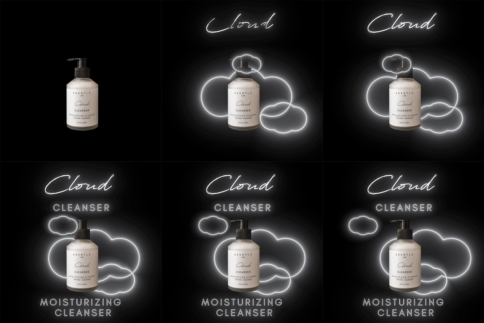
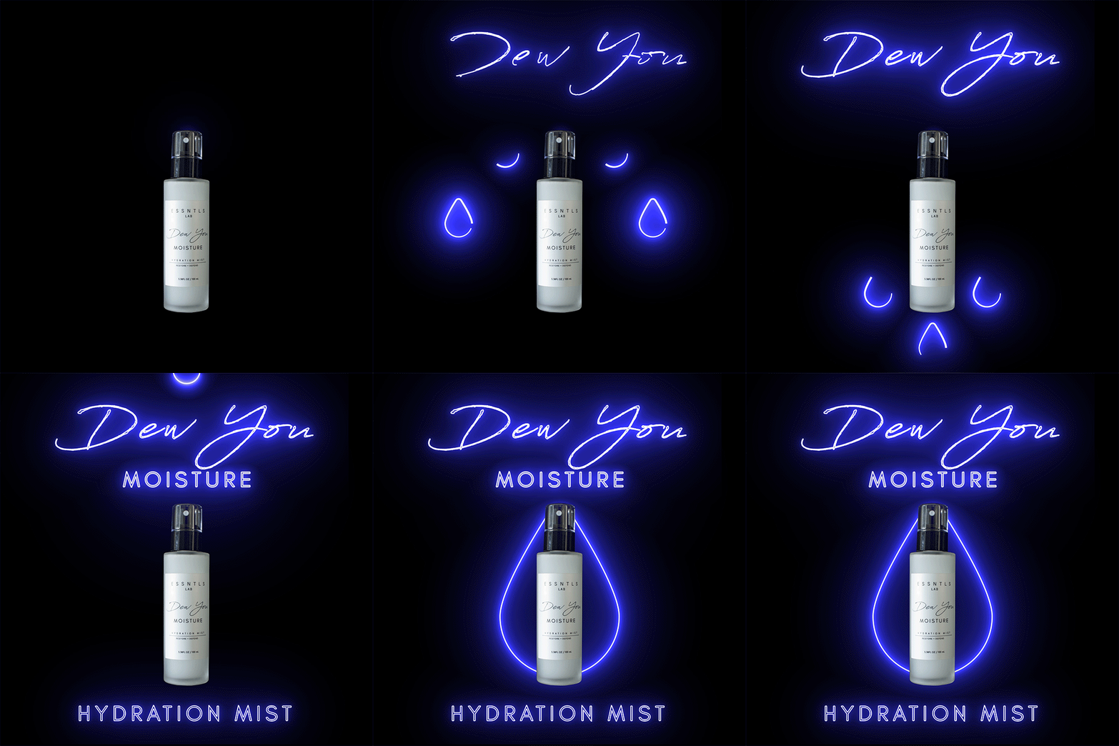
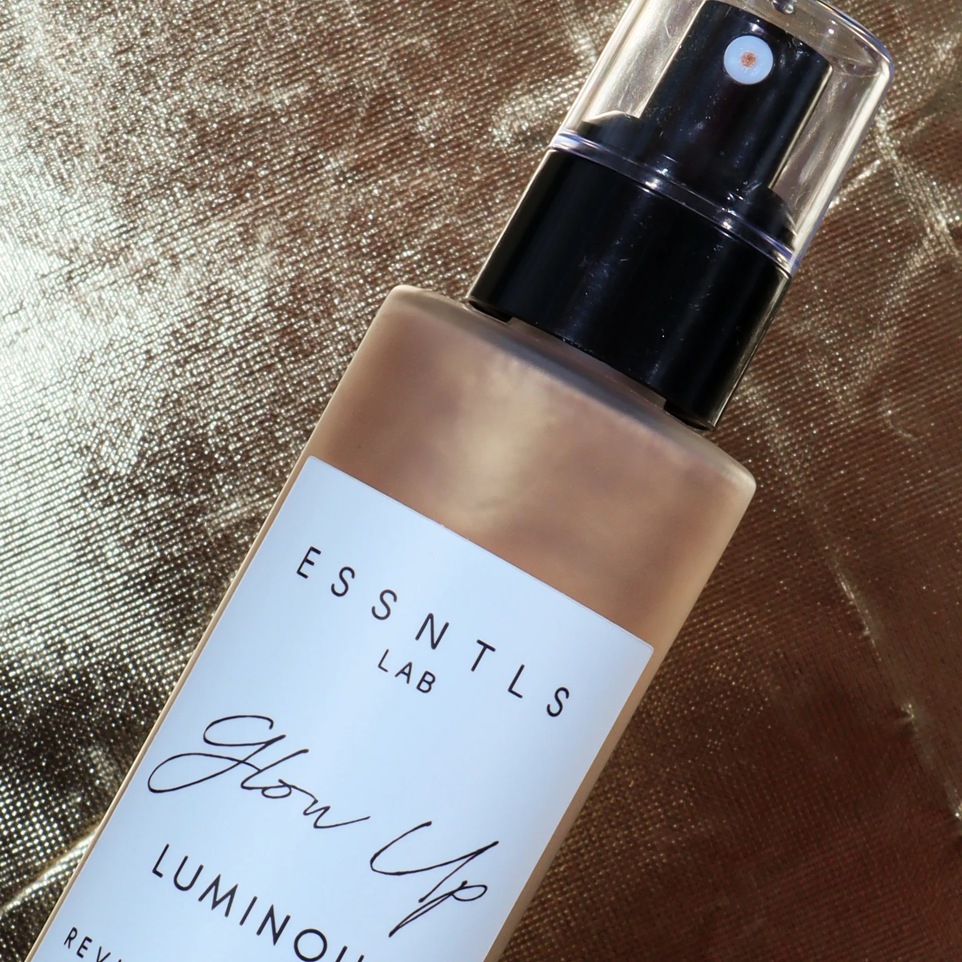
The text for the ESSNTLS collection is almost solely designed in a clean san-serif font that allows for easier reading and open spacing to allow for breathing space. This design choice allows for the handwritten styling of the product name to stand out and appear more pronounced. The handwritten calligraphy also becomes a callback to earlier days of the apothecary and the more personal relationship between chemist and consumer. This call back is a shout out to the owner of the line whose professional career is that of a chemist.
Packaging the ESSNTLS
The design of the ESSNTLS Lab packaging is a simple, clean and modern aesthetic with a luxury style feel, accentuated by frosted semi-transparent and matte black glass. The sleek design of the packaging is enhanced and maintained by water resistant labeling and recyclable glass that allows for the product to not only be environmentally friendly but match most interior design layouts for bedrooms and baths.
Brand Campaign Summer 2019
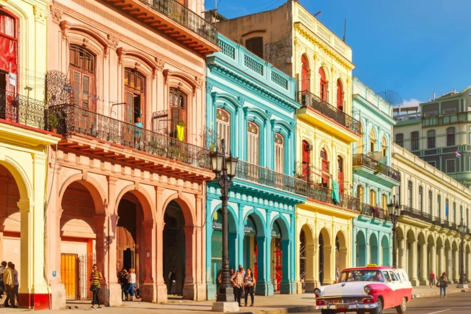
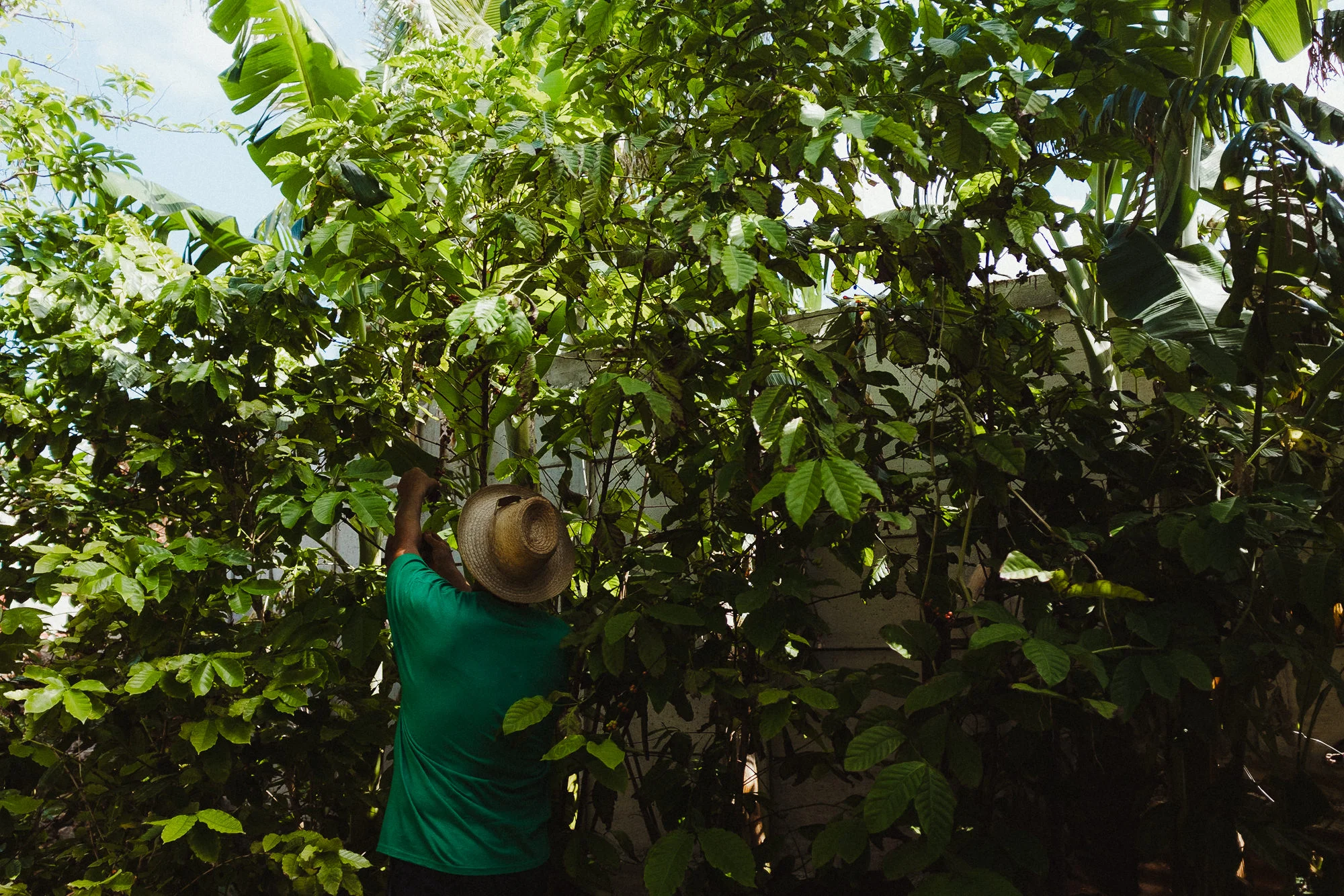
The launching products for ESSTNLS Lab summer 2019 covered cleansers, moisturizing mist and primer. The aesthetic revolved around thick luscious green foliage, dark backdrops and neon lights. The Havana nights theme has always been a summer favorite by many companies when releasing a product that wanted a sensual, passionate heated vibe, but the main concept of this campaign revolved around one main theme: moisture.
Havana, Cuba is known for the warm humid weather that allows for a variety of thick plant foliage to form on the island and the rich exciting nightlife portrayed in film and photography that brings on a sense of nostalgia . The idea of the brand is to support healthy, moisturized skin that not only looks beautiful but glows. Havana just made sense because of the moisture rich climate, the glow of the neon lights off your skin, the soft tones of the classical architecture and the positive vibes brought on by the experience of it all.


