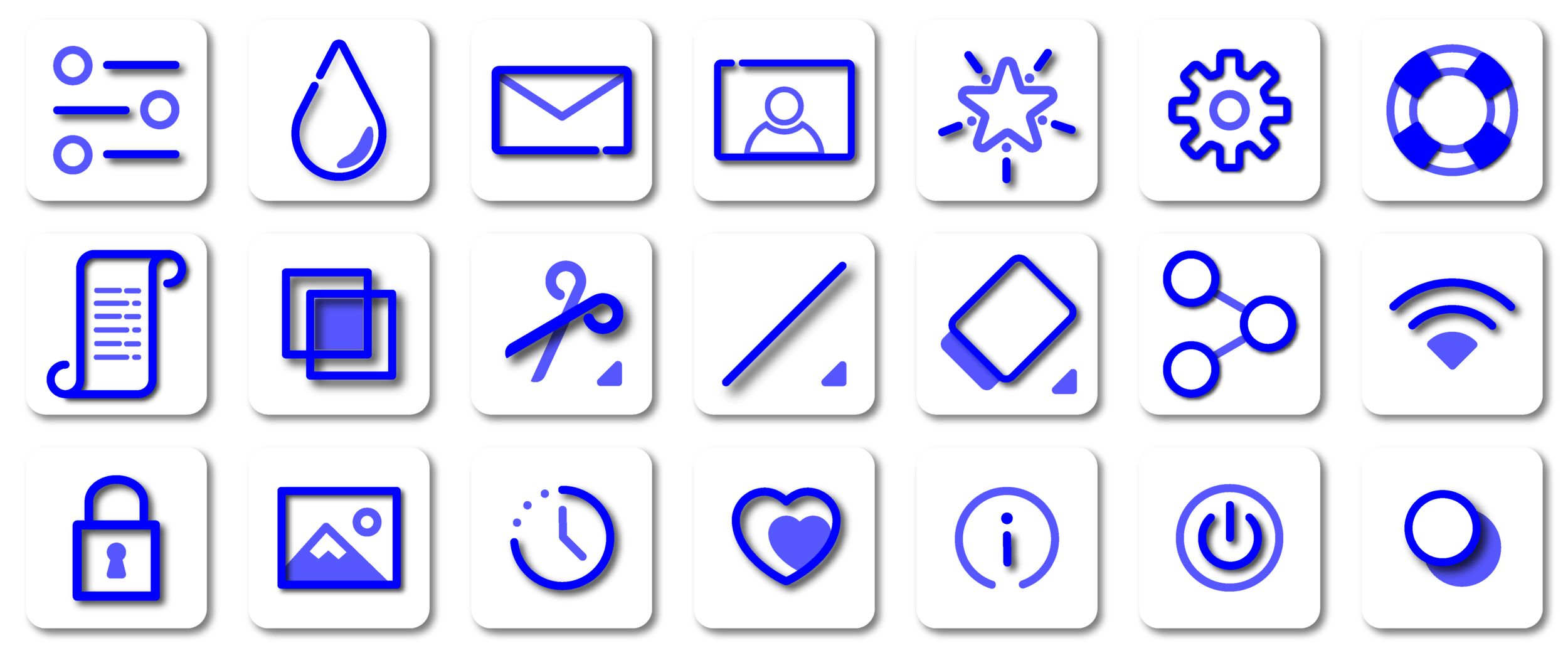
Icon Set - Bold and Blue
Tasks
Iconography is a visual language used to represent features, functionality, or content. In this icon set, I tasked myself with creating icons that are easily digestable, minimalistic and vivid enough to almost be considered decorative when used in layouts abundant with negative space.
Icons
The style of this set is based on a 3-layer set composed of a darker hue top layer, a shadow layer for depth and a base layer styled in a filled/outlined style. The aesthetic that these icons identify most with is that of the technology industries. Technology based design in most cases go for a clean minimalistic aesthetic, which lends itself to supporting imagery that generally is made to pop as to give life to the layout. Minimalistic icons also allow for micro-interactions such as simple motion graphics to be implemented that create smooth transitions during the user experience.
Icon Creation
The icons are created using the most simplistic shapes pertaining to the icon's meaning. In the case of a scroll icon, the image is based off the most prominent shape, a rectangle. The rectangle is outfitted with secondary shapes and the pathfinder tool is then used to clip away as to create the idea of a traditional scroll. The completed scroll outline is given the primary color and shadow, while elements such as text lines are left flat and given the secondary color tone.


